5 Mistakes in Small Apartment Interiors — and How to Fix Them
An oversized sofa, wrong proportions, dark furniture, no vertical rhythm — these five mistakes show up in almost every small Berlin apartment I work in. Here's how to spot them and correct them.

Alla Tatarchuk
Alla Tatarchuk ist Interior Designerin in Berlin. Seit 2017 gestaltet sie Wohn-...
Small apartments don't forgive mistakes. What barely registers in a large flat — one piece of furniture too many, one colour too dark, one shelf too low — defines the entire feel of a small room immediately.
In the video below I walk through five mistakes I encounter again and again in small Berlin apartments: with real examples, diagrams, and concrete corrections.
If you'd rather read than watch, here are the five points in detail.
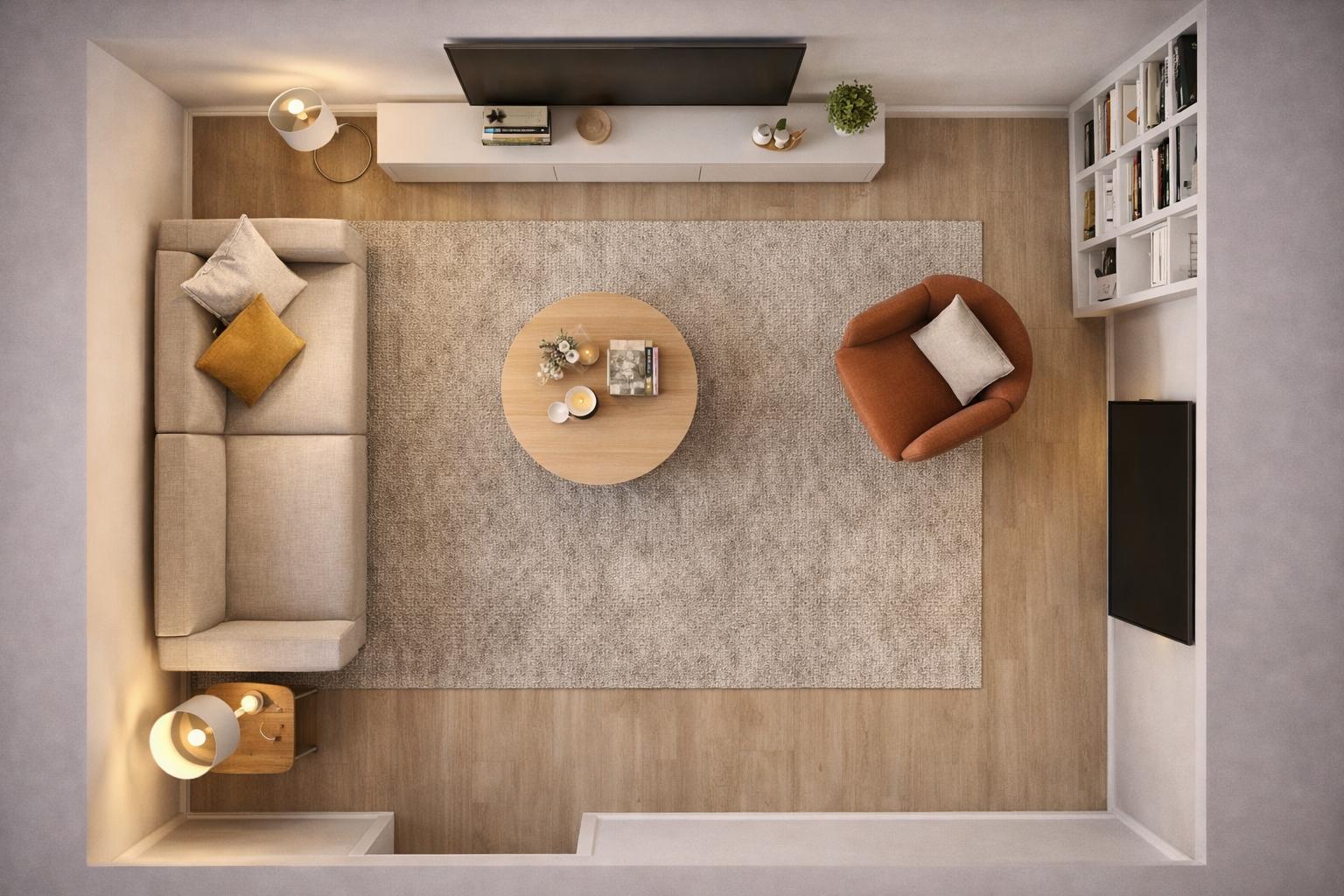
#1. The sofa is too large for the room
This is the most common mistake I see. A sofa that looked right in the showroom simply consumes everything once it's in the flat. The reason: in the furniture store it sits in a large, bright hall; at home it competes for every centimetre.
The rule of thumb: a sofa should occupy at most two thirds of the wall behind it. For a 3.5-metre wall that means around 2.3 metres — and that's already generous.
What often helps: a sofa with a lower backrest. A model at 70 cm rather than 90 cm leaves the room behind it visually open. If you don't want to sacrifice comfort: cushions raise the seating height without building up the room.
#2. The furniture proportions don't work together
It's not just the sofa — the entire furniture arrangement can overwhelm a room when the proportions are off. A typical scene: a low coffee table right next to a tall wardrobe. Or an oversized floor lamp beside a tiny side table. The room feels restless, even if you can't immediately say why.
My approach: I always plan the height line first. Which pieces are tall (wardrobes, shelves), which are low (sofa, coffee table), which are mid-height (sideboard)? A room needs all three levels — but each should be placed deliberately, not by accident.
The worst combination in small rooms: many pieces at the same height. That makes a wall flat and monotonous.
#3. Dark furniture presses down the space
A dark wardrobe in a small flat isn't automatically a mistake — but it is a risk. Dark furniture takes on visual mass. In a room with little natural light, a black or dark-brown wardrobe can make the wall feel literally closer.
What I recommend instead: if you love dark furniture, use it deliberately and sparingly — as an accent, not as a system. A dark wardrobe that runs floor to ceiling and blends into the wall colour reads differently from a freestanding dark unit placed against a light wall.
The simplest solution: furniture in wall colour or light tones lets the room flow. The piece "disappears" and the surface behind it becomes part of the space.
This is exactly the pattern we reversed in a residential project in Berlin Lichtenberg: the starting point was a large but very dark room, where heavy, low-looking furniture was compounding the feeling of confinement. After replanning with light colours, a layered lighting concept and corrected proportions, the same room feels twice as wide.
#4. A lack of vertical rhythm makes the room feel lower
A mistake that is particularly painful in Berlin Altbau apartments: furniture and decoration arranged only at mid-height. Pictures at eye level. Shelves that stop at 1.6 metres. Curtains that don't reach the ceiling.
The result: the upper part of the wall is left empty, and the eye reads that surface as "dead". The room feels lower than it is — even with 3-metre ceilings.
The correction is simple: curtains from ceiling to floor. Shelves all the way up. Hang pictures higher than feels natural. The eye follows the line upward — and "measures" the room as taller.
#5. The colours clash — even though they're beautiful individually
This is the most subtle mistake: you like every colour in the room on its own. But together they don't work. This happens when you buy pieces in isolation without holding the whole picture in mind.
The most common case: warm and cool tones are mixed without either side taking the lead. A warm-wood sideboard next to a cool-grey sofa next to a rose-gold lampshade — all three individually attractive, but without a shared language.
My approach: decide on a temperature. Either warm (wood, beige, terracotta, brass) or cool (grey, blue, white, chrome). Then one contrasting element is allowed — but one, not three.
These five mistakes have one thing in common: they don't come from poor taste but from a missing whole-room view. When you buy pieces one by one, decide room by room, and lose sight of the interplay, you almost always land in one of these patterns.
If you have the feeling that something in your flat "isn't quite right" but can't name exactly what — get in touch. The first consultation is free, and usually one look is enough to find the core of the problem.