Designing a Children's Room: 7 Principles That Last
Sleeping, studying, playing, storage — usually on 12 to 15 m². Seven principles from practice in Berlin and Brandenburg for a room that grows.

Alla Tatarchuk
Alla Tatarchuk ist Interior Designerin in Berlin. Seit 2017 gestaltet sie Wohn-...
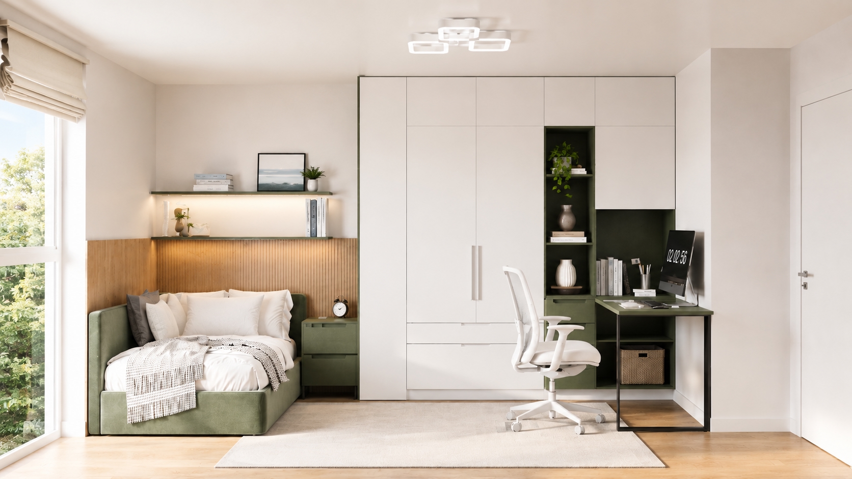
No room in an apartment has to do as much as a children's room. Bedroom, study, play area, storage and retreat — all on twelve to fifteen square metres. And unlike a living room, the way it is used does not change over ten years, but over three.
That is exactly where most children's rooms I see fail: they are planned well for one particular age — and after that nothing fits any more. These are the seven principles I return to again and again, so the room works from the start and later only needs details swapped out.
#1. Zones first, furniture second
Before I think about a single piece of furniture, I divide the room into three zones: sleeping, working, storing. Each zone needs its own wall or a clearly defined area — otherwise they overlap and the room looks permanently untidy, even when it is not.
The most common mistake: the bed ends up in the middle of the room or in front of the only wardrobe. From then on, every further decision is a compromise. Zoning determines the room, not the choice of furniture.
#2. One wall, one line
In narrow rooms — and children's rooms are almost always the narrow rooms of an apartment — the most important decision is to plan the long wall as a single continuous structure instead of a row of separate pieces.
A wardrobe, open shelving and a desk in one continuous run feel calm. The same three functions as three free-standing pieces with different heights, depths and colours feel cramped — even though they take up exactly the same space.
That is how the children's room in a Berlin project in Pankow came about: a floor-to-ceiling white wardrobe wall, an adjoining open shelving unit in sage green and the desk directly beside it. Storage and workspace become one line instead of three loose ends.
#3. Build all the way to the ceiling
The metre between the top of a wardrobe and the ceiling is the most frequently wasted storage in children's rooms. It collects dust and boxes, and it makes the room look lower, because the eye stops at the edge of the cabinet.
Floor-to-ceiling wardrobes solve both at once: they add roughly thirty per cent more storage and draw the line upward. The top holds what is rarely needed — winter clothes, memory boxes, toys from the previous phase. Everyday life stays within reach below.
#4. The desk belongs by the light, not in the corner
A desk facing a wall and turned away from the window stops being used around year three of school. The child moves to the kitchen table instead — and the desk becomes a surface for piles.
A workspace needs daylight from the side, a depth of at least sixty centimetres, a socket at desk height and room for a proper office chair. It sounds obvious, but it decides whether the most expensive square metre in the room gets used at all.
#5. Hold back on colour, give character through one surface
Colourful children's rooms age quickly. What delights a four-year-old embarrasses a nine-year-old — and then comes a renovation nobody planned for.
My approach: keep the furniture calm — white, warm wood, one muted tone. Let a single surface carry the character: a wallpaper, a coloured shelf interior, a wall panel. That one surface can be replaced in five years for very little money, without refurnishing the room.
A wall mural with a muted motif works better for this than three colourful pieces of furniture: it gives the room depth without making it smaller.
#6. Plan light on three levels
A children's room needs three kinds of light, each on its own switch: ambient light at the ceiling for tidying and playing, directed light at the desk for studying, soft light by the bed for reading and falling asleep.
If this is decided only after the walls are painted, you end up with cables running along every wall. Lighting belongs in the plan, not in the hardware-store run afterwards.
#7. Design around what makes the child different
This is the point standard solutions fundamentally cannot cover: one child plays piano, the next paints, the third builds models, the fourth needs space for sport.
In the Pankow room it was a digital piano. It was given a fixed place along the window wall — with a socket and clear space for the stool. Not squeezed in afterwards, but part of the plan from the beginning. That is the difference between a room a child lives in and a room made for that child.
A good children's room does not need extra square metres. It needs clear zoning, one continuous line instead of many separate pieces, storage up to the ceiling, and a plan that already takes the next age into account.
If you are planning a children's room — as part of a whole apartment or as a single room, in Berlin, Brandenburg or anywhere in Germany online — feel free to get in touch. The first consultation is free, and often the floor plan alone shows where the real potential lies.